MyChart by Epic
A case study of the sign in experience, highlighting improvements to the user interface, accessibility, and user experience.
As the healthcare industry embraces technology to connect with patients, how can the experience be improved?
The objective of this UX/UI case study is to evaluate and improve the user experience of the MyChart healthcare app.
The study focuses on analyzing and redesigning the login page based on research insights and best design practices. The project aims to create a user-centered design that enhances the app's usability, accessibility, and visual appeal while aligning with the brand's guidelines and requirements.
About MyChart
MyChart by Epic is a web portal that allows patients to manage all their healthcare needs. With MyChart patients can access health information including: medications, test results, upcoming appointments, medical bills, and price estimates. Additionally, patients are able to schedule appointments, contact their care team via secure messaging, and connect with their provider via a virtual visit.
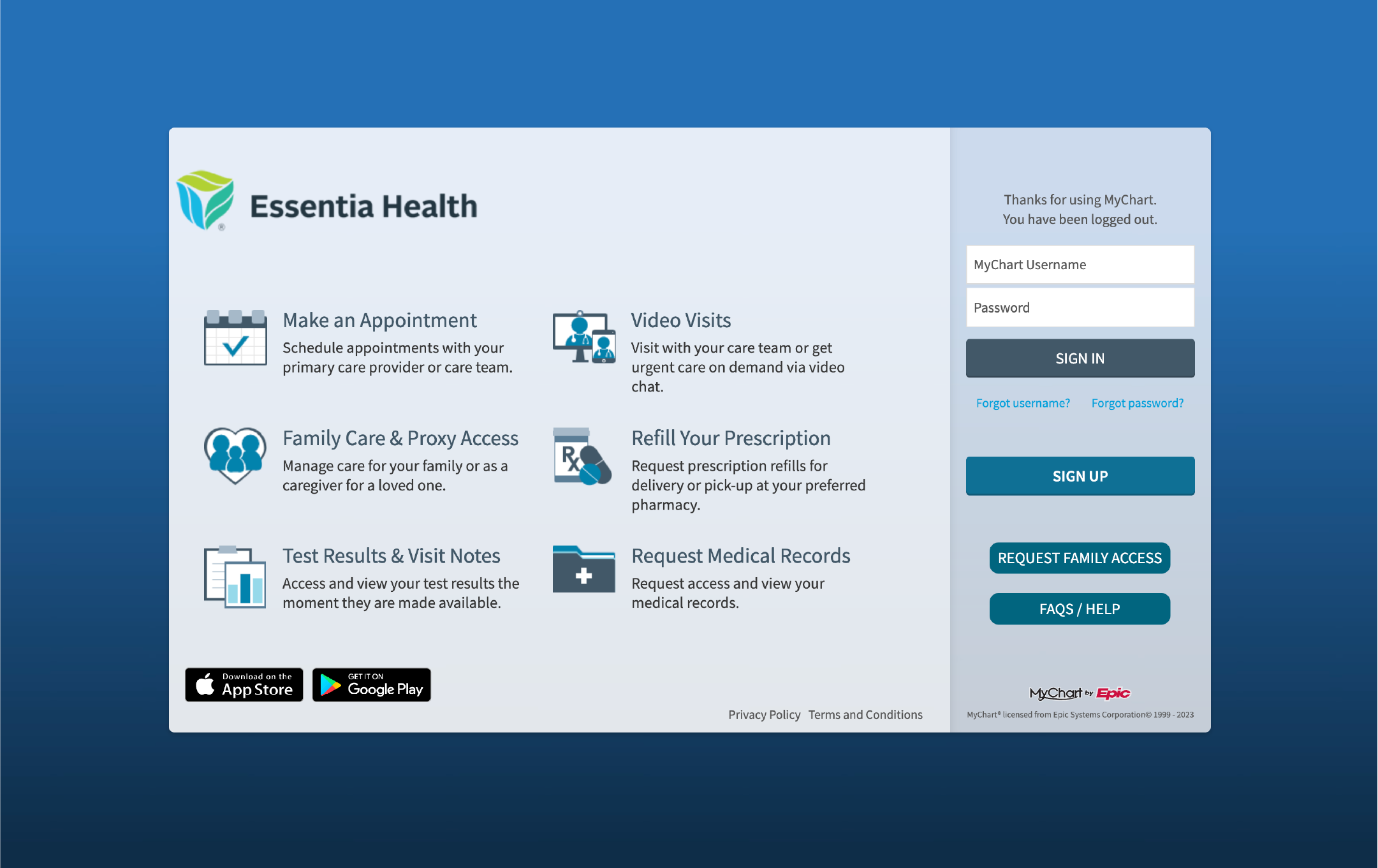
App Analysis
The login page of MyChart has several design inconsistencies that affect its usability. First, the button style is inconsistent, with varying font weight, background color, size, and border radius. Second, the primary action for this page is unclear due to too many buttons and a lack of hierarchy. Third, the low contrast is a problem for accessibility, as everything is a shade of blue or gray. Finally, the page elements are misaligned making the page feel cluttered.
Research
To gain insights into MyChart's user experience, I usedG2 Crowd reviews to provide valuable feedback from real users. This research helped me to identify some common pain points, strengths, and weaknesses of the app, which informed my design decisions throughout this case study.
Personas
I found it intriguing to redesign a healthcare app because of the diverse user base to consider. The app must be accessible and user-friendly for all ages, abilities, and cultures.
It challenged me to think about users who may have limited experience with technology or those with disabilities, such as visual or hearing impairments. Additionally, healthcare apps serve a diverse demographic,including individuals from different ethnic and cultural backgrounds, speaking different languages, and having varying levels of health literacy.
User Flow
To access the MyChart login page on a desktop involves navigating to the healthcare provider's website, finding the MyChart login button or link, and entering login credentials or creating a new account if necessary.
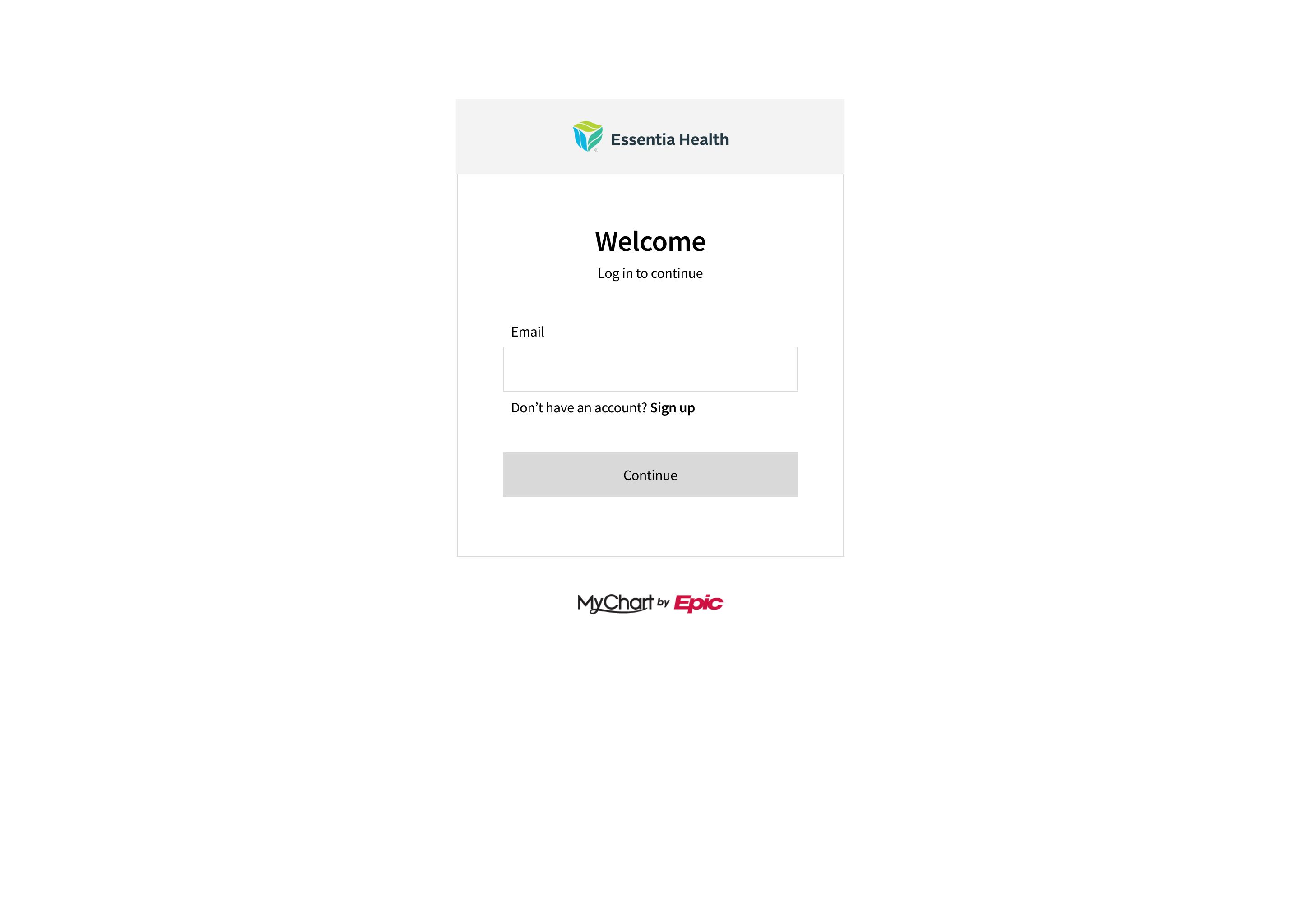
Low Fidelity Wireframes
After conducting user research, I began the design process by creating low-fidelity wireframes. I explored different design concepts, including a stripped-down version as well as a version with all the information but organizing it in a way that clearly communicates the primary action and purpose of the page.
This process allowed me to iterate quickly and efficiently while ensuring that the final design would meet the needs of the app's diverse user base.
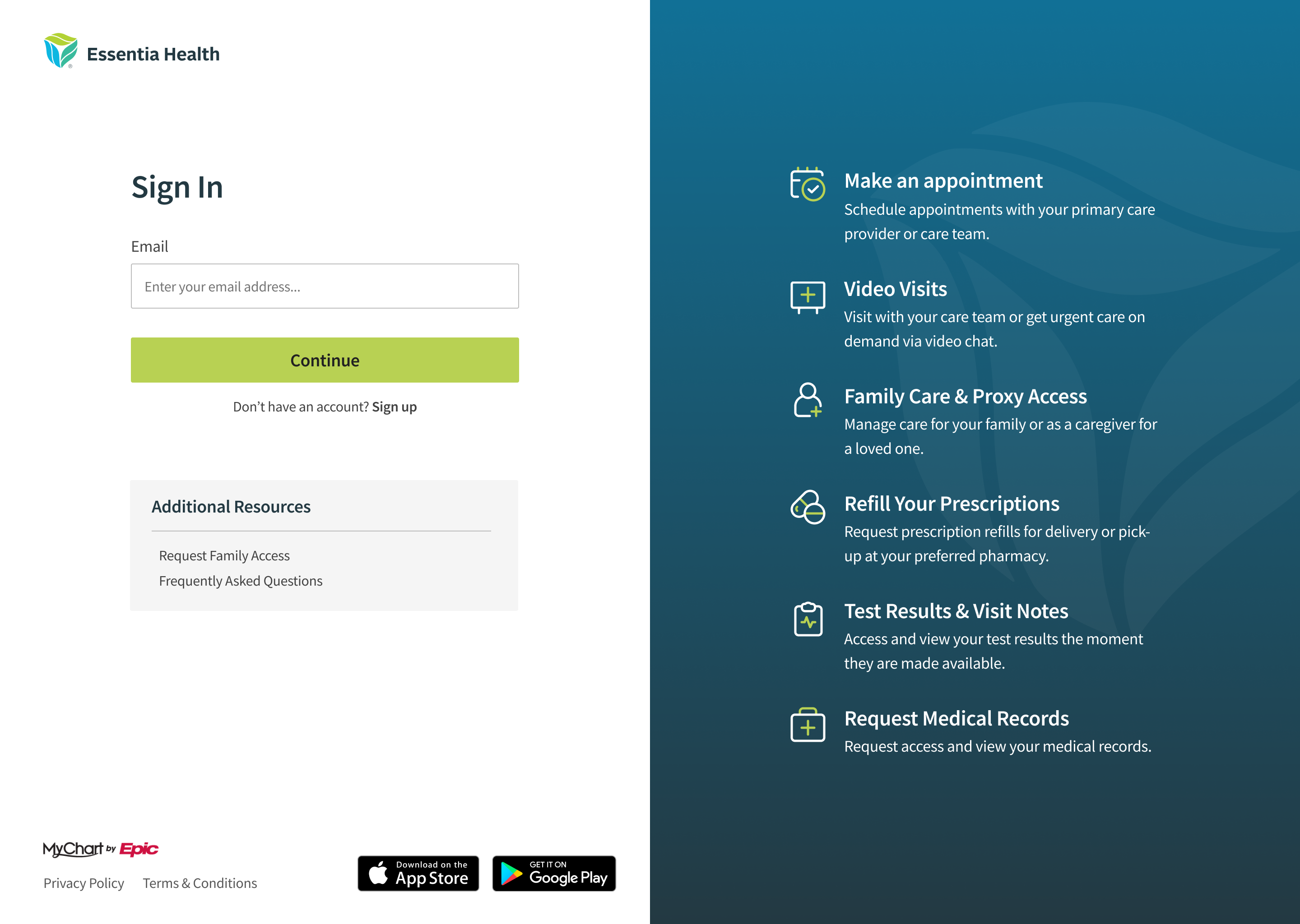
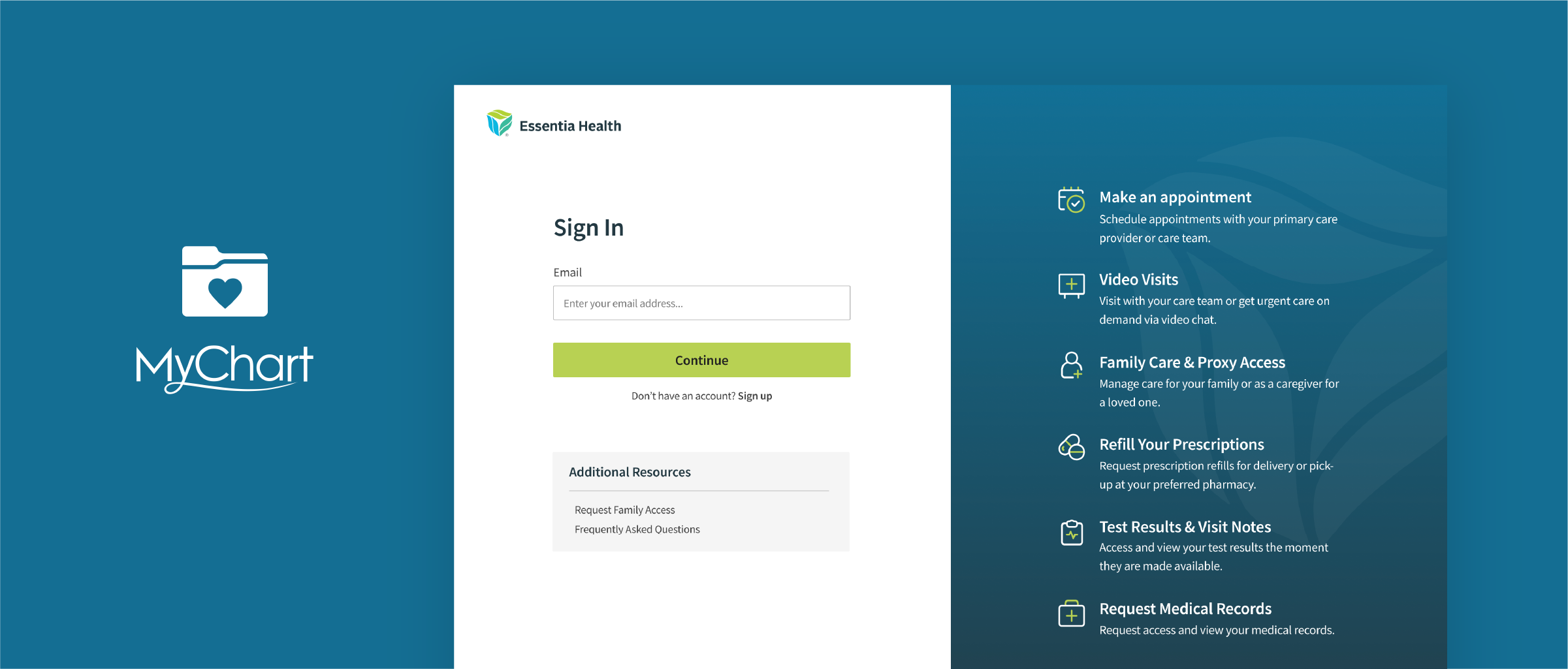
High Fidelity Mockups
After iterating through different low-fidelity wireframes, I moved on to creating high-fidelity mockups of the login page. With a clearer understanding of the primary action and purpose of the page, I was able to add visual design elements such as typography, color, and imagery that would enhance the user experience.
While the high-fidelity mockups represent a significant improvement over the original login page design, further testing and iteration would be ideal. A/B testing or gathering more feedback from users would help to ensure that the redesigned login page effectively meets the needs of all users and achieves its intended purpose.
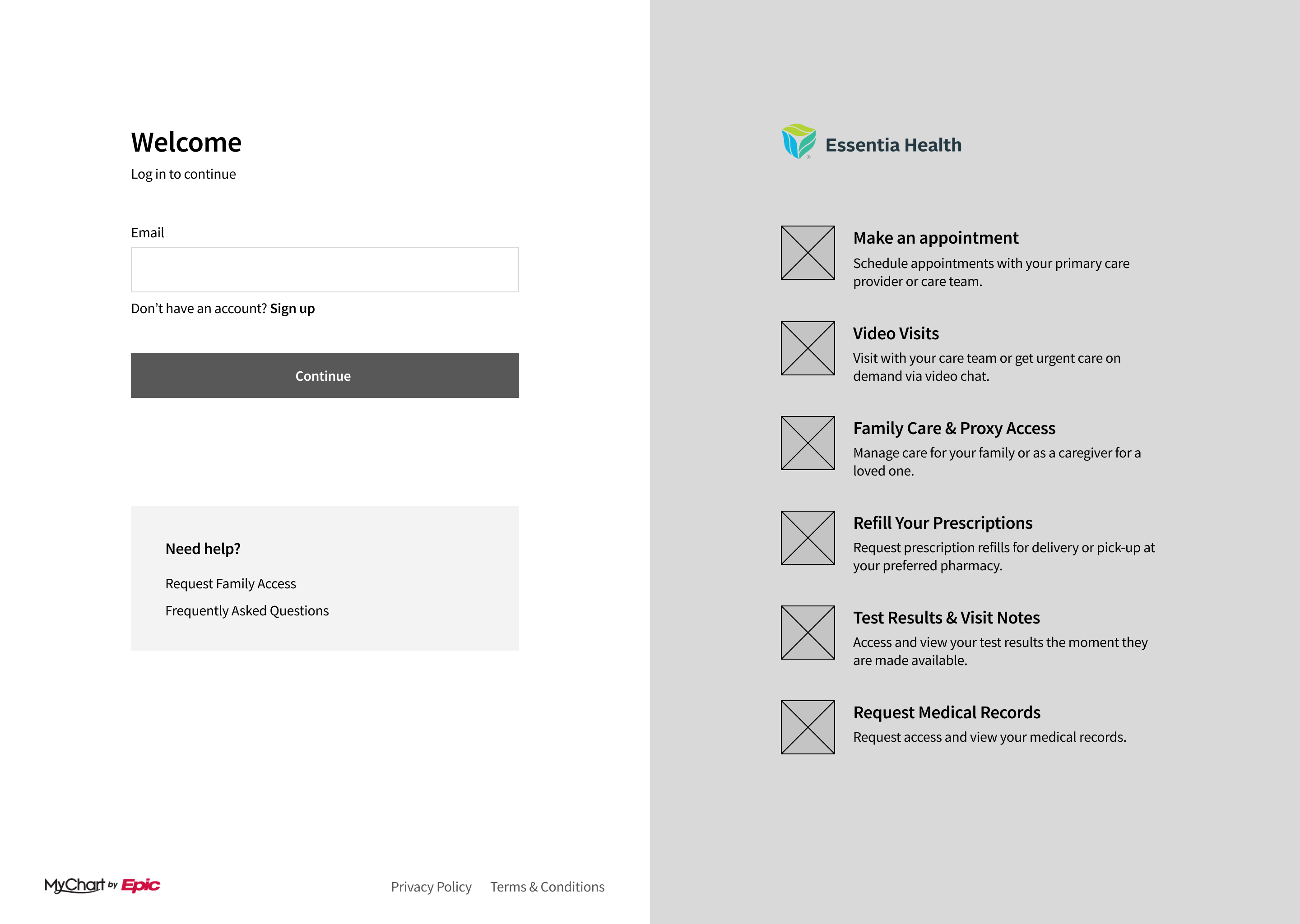
Design Decisions
When designing the MyChart login page, I focused on establishing a clear element hierarchy to help users navigate the page and complete the desired action. Let’s take a closer look at the form elements.
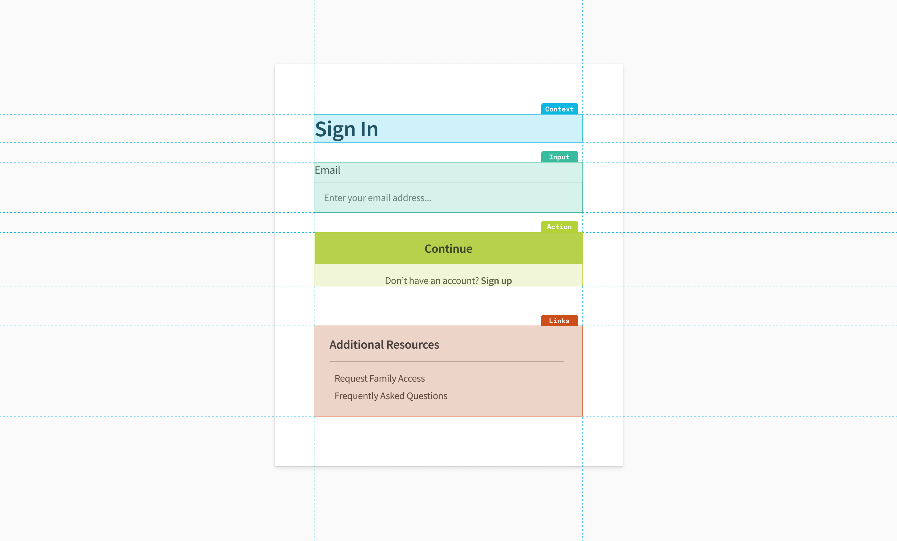
Hierarchy
The four main groups that make up the form are:
- Context: This group includes the page title and other contextual elements that help users understand what the page is for and what they can expect to accomplish.
- Form Inputs: This group includes all the fields that users need to fill in to complete the primary action, such as email and password fields
- Actions: This group includes the primary action button that allows users to move forward, as well as a secondary action that allows users to switch to a different option, in this case, signing in.
- Links: This group includes any secondary actions or resources that users may need at this stage of the login process.
To make it easier for users to process each of these groups individually, they are separated into distinct divisions with clear visual hierarchy.
*Note: I did not include a password field. Based on user feedback it was clear they struggled with the sign in process using a User ID and password. Therefore, I propose using a passwordless authentication sign in.
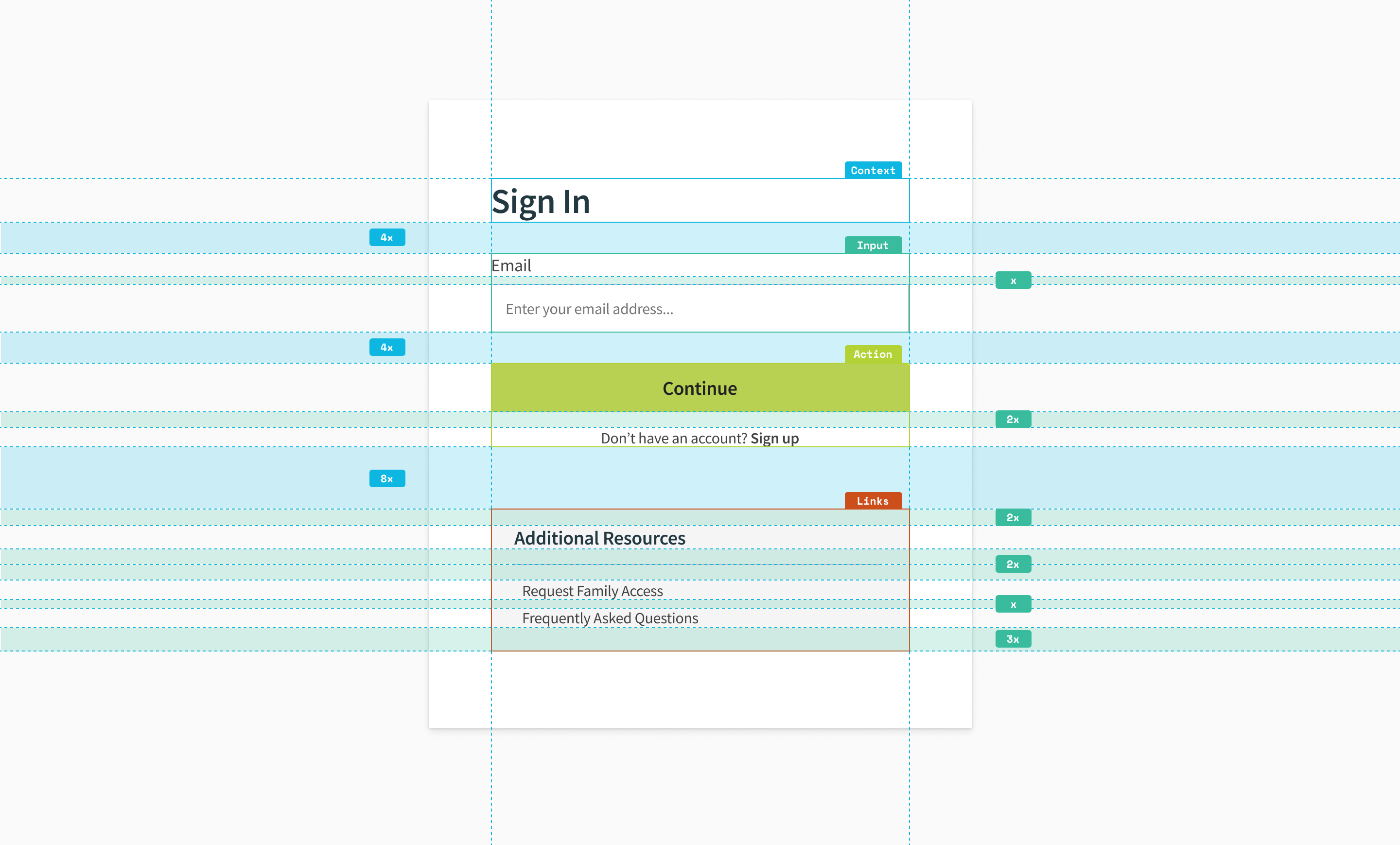
Grid
I prioritized consistency and alignment by using an 8-point grid system. All spacing is a multiple of the base number. This approach ensures that all elements on the page have a consistent and harmonious relationship to one another.
To maintain the rule of proximity, I ensured that the spacing between elements followed the grid system. This meant that elements that belonged together, such as those within a hierarchy group, were spaced closer together than elements that were separate, such as the hierarchy groups themselves.
Fonts
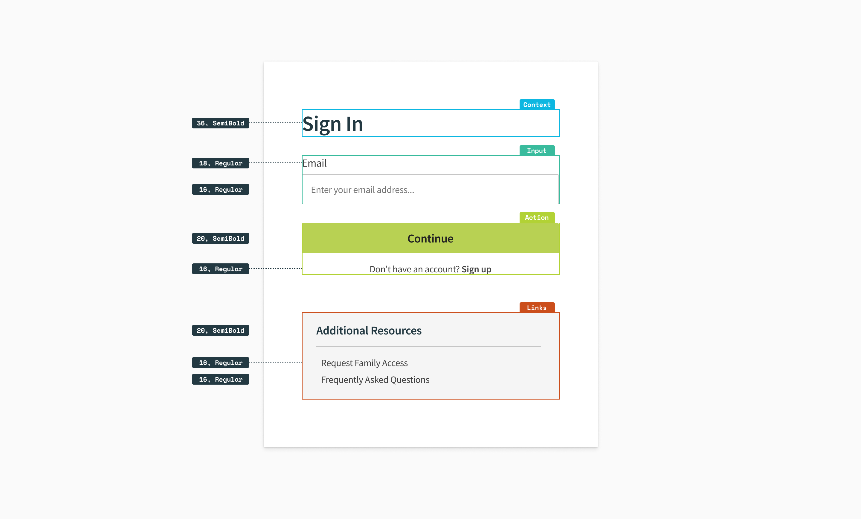
I aimed to create a clear hierarchy and improve on-screen readability using one font family, two font weights, and four font sizes.
- Font Family: Source Sans Pro, a popular sans-serif typeface known for its legibility on screens
- Font Weight: Regular and Semibold, distinguish between headings and body text
- Font Size: 16, 18, 20, 36, larger sizes used for headings and buttons help them stand out

Accessibility
I prioritized accessibility and ensured all page elements met minimum contrast requirements.
In addition to meeting accessibility guidelines, I aimed to use clear and concise language throughout the form element to avoid confusion and help users quickly understand the purpose and primary action of the page.
To Wrap Up
Of course design is never done. Even after implementing this redesign, there is always room for improvement. It's important to track how the updated sign in page performs over time to identify areas for further refinement.
I am not affiliated with MyChart by Epic in any capacity. The views for this case study are strictly my own.